Chitkara Chalkpad: UX Case Study
I am a UX Design student at Chitkara University, and when I was first admitted to the University, and given access to the online portal of the university, I felt very strange! The online dashboard was very weird, the product was very less usable and efficient. By the way, the below image is the final product :D

What is Chitkara Chalkpad?
Chitkara Chalakpad helps with fetching the details like marks/grades, fee payment details, attendance information, important notices from the University and comments from the faculty.

.
This is the original snapshot of the dashboard of Chalkpad.
The presentation link for the Case Study is available here.
I found out a lot of UX issues with the design, which I have further discussed in the coming paragraphs.
.
.
“People ignore design that ignores people.”
My Initial Observations
- The Portal isn’t mobile-friendly in the phone’s browser.
- A lot of features in the portal are not useful.
- Navigation is jumbled up
- The design is super old, seems from 2007.
- Terminologies are not clear.
- Most of the links don’t work on the Portal, common example :
Wikipedia Link, University doesn’t have a wiki page. - Popups on the dashboard were somewhat annoying. Moreover, the pop-ups don't have any CTA (Call to Actions).
My problem statement?
Chitkara Chalkpad Portal has a lot of usability issues, and it's not letting the students to use the platform effectively and efficiently.
Heuristics Evaluation
The first and foremost step I took was to evaluate the product based on heuristics. Here, are some of the snapshots of the heuristic evaluation

Problem Addressed regrading Match between system and
the real world and Aesthetic and minimalist design

The problem was addressed regarding Recognition rather than recall

Aesthetic and minimalist design is missing from the product
These are just a few examples of the problem with the heuristics, and there were around 20–25 more problems that I have found.
What are the Possible User’s Goals?
Based on my initial observation and before the user interview’s, I just tried to think of the possible user goals can be:
- Determining the Fees(the price) and paying them.
- To check Grade Details.
- To check the Attendance.
- Hostelers use it to generate gate pass.
- To Update and Verify the student info :
For eg — Name of Parents, Current Address, and Updating photograph. - For giving feedback, or any complaints.
The Survey
From the survey, I have taken, I came to realise about a quite a few things :
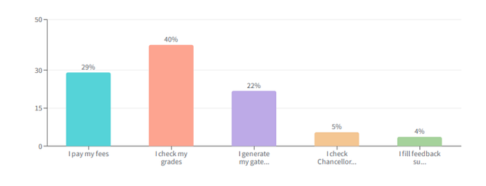
The below survey details are in Features vs User Voting
Most Important Tasks
- Checking Grades — 40%
- Paying Fees — 29%
- Generating Gate Pass — 22%
- Checking Chancellor’s Messages — 5%
- Filling Surveys — 4%
Other Facts
- 56% of Students have issues regarding paying the fees.
- On a scale of 1 to 10, 52% of students voted less than 6.
- 92% of students felt the need for an official app for Chitkara Chalkpad.
The Painpoints of the Students
After conducting the user survey and user interview, I concluded the painpoints suffered by the Chitkarians, and that was:
- The website is not mobile-friendly but is adaptive though.
- The fees option isn’t available on the homepage, so have to navigate to the Paying fees section using the menu bar.
- Not able to find correct option, according to the need. For example: Voting for adorable Teacher, Option is hidden under the Student Info.
- The layout feels cluttered.
- Too many useless features overshadow the important features of the Dashboard.
- Don’t feel credible because of the outdated design, which leads to less engagement Level
Empathizing with the User
It was my time to put myself into the user’s shoes and to feel what are they feeling, and for better grasping the idea, I created a persona, Empathy map, User Scenario and Customer journey maps.
The Persona

Please find the Empathy map, User Scenario and Customer journey maps on slide number 20–25 of this presentation, Otherwise, this article will never finish, LOL!
The Decision
During the conduction of the User survey and User Interview, I came to know that the mobile interface can be more beneficial to the user’s rather than a computer dashboard, since this product is going to be used frequently, and it's not expected from them to open their systems every time.
Creating Task Flows and User Flows
Now it was time, to get deep dive into actually providing the solutions. So, I mapped out the As is Task flow(Original Task flow) and created To be Task flow(New Task flow).
Task flow I
Scenario — Sarthak’s Mentor has told Sarthak(The boy in the persona) to pay the fees before the new semester starts, and ones He has paid the fees, he should generate the fee recipt and send the mentor back.
The end goal of Sarthak — To Pay the fee and then Generate the Fee Receipt

Below is the To be Task flow (New Task flow)

The User flow for the above task flow

For more user flows and task flow’s, Please visit the presentation
Creating Wireframes
After understanding and creating the Task flows and User flows, I started with designing the Wireframes for the product.


Final UI creation
One of the most crucial decisions for me was to change the colour of this product from red => blue.
It was a tough decision, and I changed the path because of colour psychology theory.
Which says Red colour denotes — Strength, Power, Anger, Alarming
whereas my mission was to make the product seems — productive, trustful, stable, calm, non-threatening.
This is the reason why I chose to go with the Blue colour!


The Final UI Design
Here, are all the screens, Hope you enjoyed the time you spent reading this article with me!


Hope you really enjoyed my work, if you want to reach out to me: then connect me on LinkedIn